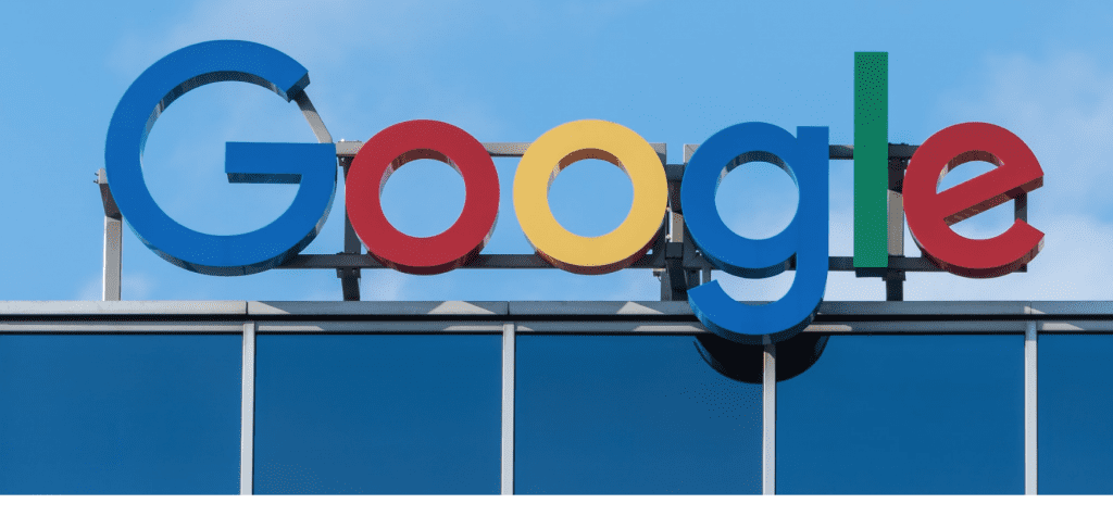
On September 1, 2015 Google revealed to the world its first major logo update in 16 years. The iconic Google word mark had been transformed using Google’s new proprietary “Product Sans” font, and in doing so, the American multinational technology company seemingly kicked off a larger movement towards the adoption of pared back logos, which was demonstrated in industries ranging from tech to high fashion. At the same time, the Menlo Park-based giant also revealed a new “G” logo, incorporating the four colors found in the word mark. The developments made headlines across various major media outlets, all of which noted Google’s biggest branding update in almost two decades.
The new Google word mark and its “G” logo were designed with mobile media in mind. The sans serif font used in Google’s revamped word mark is easier to read in smaller font sizes, a major advantage when portraying your logo on smart phones and other small handheld devices. Where the scaled down font is too small to read, Google can use its “G” logo as its brand identifier. But Google did not stop there. Google introduced a third “mark,” one that consists of four dots in the same Google colors. These dots – which move in different patterns when the digital device on which it is displaying is performing a function – transform back into the Google word mark, or the G logo, when the function is complete.
These new branding assets – working in tandem via animation – will likely be the most prominent example of a new type of trademark, one which can exist only in the digital world. With that in mind, the release of these marks has been received with wide praise from the branding community.
Digital marks raise some interesting issues for the trademark bar and the courts to resolve. Even though there is little reason to doubt that Google could obtain federal registrations for the three individual components – word, logo and dots – what happens when one of those marks – the dots – appears only momentarily, and then vanishes? Can a transient image serve as a trademark? Also, do the dots function as a trademark independent of their use in the animation? How broad will be the protection afforded such marks? For example, what if a competitor uses four diamonds (either mono-colored or multi-colored) instead of dots, which transform into the competitor’s name?
Another issue highlighted by the Google “G” logo is one that has been brewing in the digital media community for some time: will trademark fair use principles need to transform to accommodate the digital world? In traditional fair use analysis, courts generally allow a person using another company’s name to identify the company by that name, so long as the purpose is for identification of the company and not to trade on the goodwill associated with that company or otherwise cause confusion among consumers.
This principle, referred to as “nominative fair use,” draws a line at allowing that person to use a company’s logo for the same purpose, as the use of the logo suggests an affiliation or relationship that may not actually exist. Thus, a mechanic can advertise in the yellow pages that she can repair Audi vehicles, but she cannot use the Audi logo in the ad unless she is an authorized Audi repair shop.
While traditional nominative fair use rules work well in the brick and mortar world, the fairness of that rule is more suspect in the mobile media space, where the real estate for advertising has shrunk to fit on your phone screen and it may not be possible or practical to use a company’s full. Some companies – Twitter, Facebook, and even Google, as examples – have addressed the problem through limited permissive use. These companies let third parties use their logos for limited nominative purposes, subject to the third parties’ compliance with corporate guidelines. If those guidelines are not followed, however, or if the company a party wants to identify has no such guidelines, then under current law the party should not use the company’s logo for nominative purposes, even if it cannot fit the full name of the company on the screen in a readable manner.
How big of an issue will the fair use issue become with respect to mobile media? Will this issue ultimately reach the courts or the Congress? Looks like we might need to run some more Google searches to find out.
*This article was originally published in September 2015.
Mitchell C. Stein is an intellectual property and litigation attorney in Sullivan & Worcester’s New York office. He focuses his practice on litigation and licensing related to software, e-commerce, drugs and medical technology, copyrights, trademarks and rights of publicity. (Minor additions in the intro. courtesy of TFL)
Share