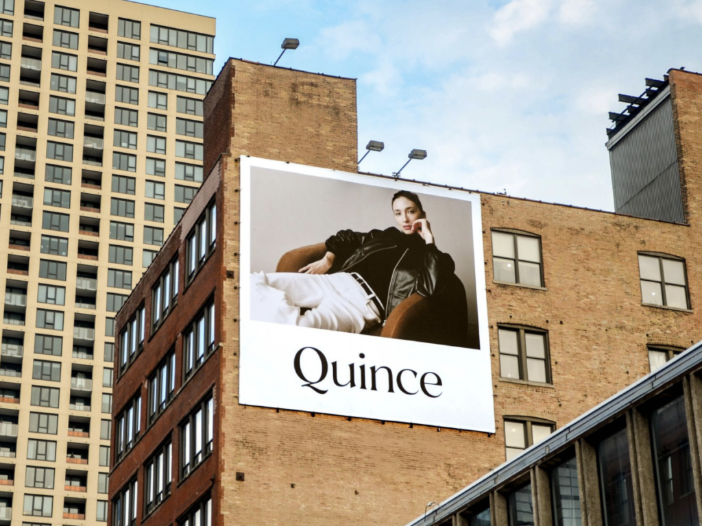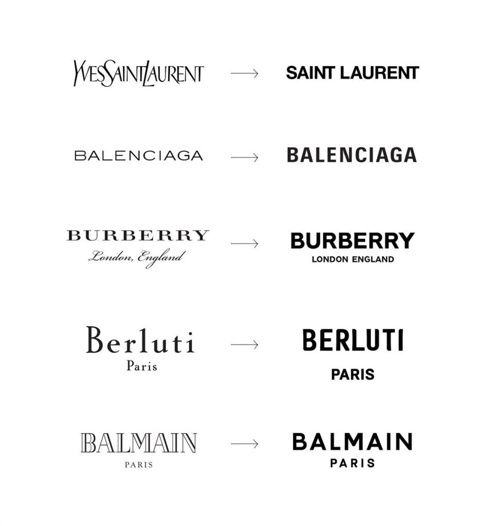
High fashion brands’ logos have followed a path to marked similarity in recent years. Yves Saint Laurent – sans the “Yves” – swapped its skinny, slightly angled word mark for a bold and largely pared down “SAINT LAURENT.” Burberry traded in its serif font and accompanying cursive (for the “London, England”) for an almost identical sans serif type as YSL’s. Balenciaga did away with its super-thin font in favor of a bolder, block letters, and Balmain gravitated away from its stylized font for … you guessed it, a bold, sans serif type. The movement came to be characterized as “blanding,” as an array of brands relied on a handful of the same creatives to revamp the appearance of their trademark-protected names and logo.
Looking beyond the shift from stylized marks to an overload of bold, geometric sans-serif font, websites are on something of a similar journey. “Why are all websites starting to look the same?” That is the question that has prompted a growing number of articles and blog posts over the past few years, most of which point to a common design elements, from large images with superimposed text, to hamburger menus, which are those three horizontal lines that, when clicked, reveal a list of page options to choose from. Such claims have even appeared in lawsuits, such as the one that Daily Harvest recently filed against a fellow DTC frozen health food company.
Sam Goree, a PhD Student in Informatics at the Indiana University, and his colleagues Bardia Doosti, David Crandall, Norman Su noticed an influx of these posts when they were studying the history of the web. They also noticed that none of the authors of the aforementioned articles had done any sort of empirical study in furtherance of their assertions that the designs of websites were morphing into uniformity. Instead, such proclamations came from the authors’ hunches.
Such a lack of empirical evidence prompted Goree and the other Indiana University academics to investigate the claim to see if there were any truth to the notion that websites are starting to look the same and, if so, explore why this has been happening. To do so, they ran a series of data mining studies that scrutinized nearly 200,000 images across 10,000 websites.
Goree reflects on how he and his colleagues approached the study, and ultimately, what they found …
How do you even measure similarity?
It is virtually impossible to study the entire internet; there are over a billion websites, with many times as many webpages. Since there’s no list of them all to choose from, performing a random sample of the internet is off the table. Even if it were possible, most people only see a tiny fraction of those websites regularly, so a random sample may not even capture the internet that most people experience.
We ended up using the websites of the Russell 1000, the top U.S. businesses by market capitalization, which we hoped would be representative of trends in mainstream, corporate web design. We also studied two other sets of sites, one with Alexa’s 500 most trafficked sites, and another with sites nominated for Webby Awards.
Because we were interested in the visual elements of these websites, as data, we used images of their web pages from the Internet Archive, which regularly preserves websites. And since we wanted to gather quantitative data comparing millions of website pairs, we needed to automate the analysis process. To do that, we had to settle on a definition of “similarity” that we could measure automatically. We investigated both specific attributes like color and layout, as well as attributes learned automatically from data using artificial intelligence.
For the color and layout attributes, we measured how many pixel-by-pixel edits we would have to make to transform the color scheme or page structure of one website into that of another. For the AI-generated attributes, we trained a machine learning model to classify images based on which website they came from and measure the attributes the model learned.
How has the internet changed?
We found that across all three metrics – color, layout and AI-generated attributes – the average differences between websites peaked between 2008 and 2010, and then decreased between 2010 and 2016. Layout differences decreased the most – declining over 30 percent – in that latter time frame. These findings confirm the aforementioned suspicions that websites are becoming more similar.
After uncovering this trend, we wanted to study our data to see what kinds of specific changes were causing it.
You might think that these sites are simply copying each other’s code, but code similarity has actually significantly decreased over time. (This is potentially because such code is protected by copyright law, and at least some website owners actually enforce those rights). However, while code-copying has decline, the use of software libraries – which feature collections of generic code for common tasks, like resizing a page for mobile devices or making a hamburger menu slide in and out – has increased a lot, thereby, explaining some of the commonality among sites that use certain less-flexible libraries.
The changes that occurred between 2005 and 2016 illustrate what is happening. Sites with average similarity scores in 2005, for example, tended to look less similar than those with average similarity scores in 2016.
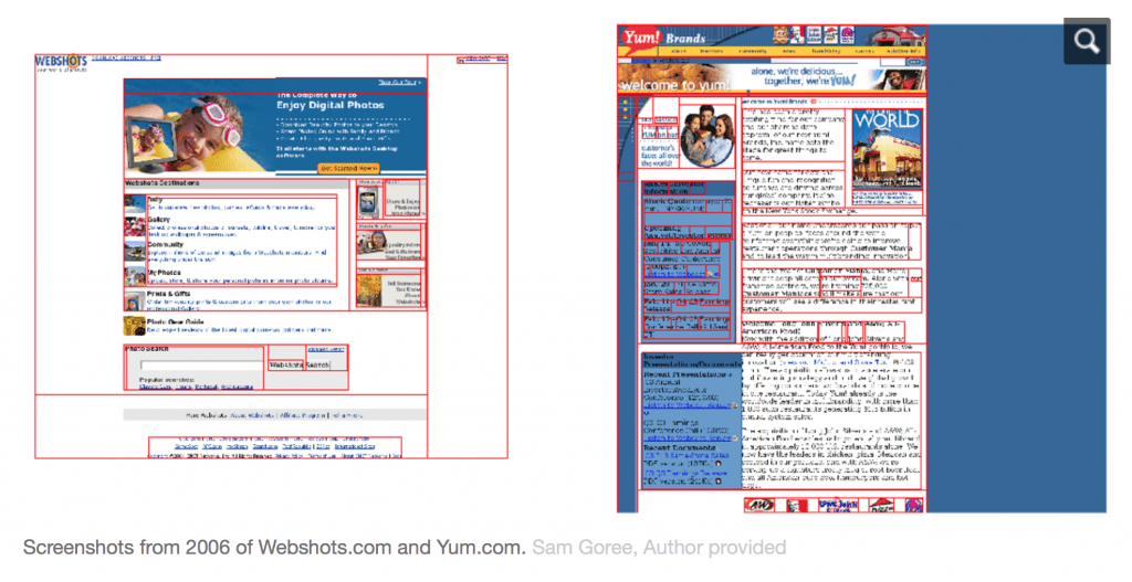
For example, in 2005, Webshots.com, a photo wallpaper and screensaver service company’s website, and Yum.com, the site for the world’s largest restaurant company, were considered relatively similar. This was the case even though they had somewhat different color schemes and very different layouts. While they both mostly use white, blue and black, the site on the right has a blue background.
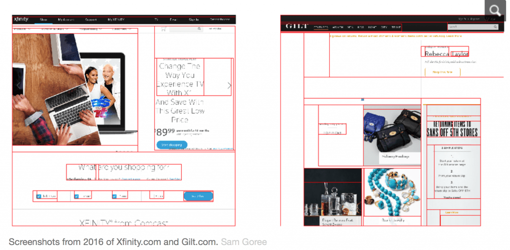
Fast forward to 2016 and the websites of Xfinity.com and Gilt.com have the same general similarity score as Webshots and Yum did in 2005. Yet, the designs of the Xfinity and Gilt sites are much more similar than those of their 2005 counterparts. They both have a menu bar on the top, and are primarily white and black with images. These pages have much less text and make better use of the higher resolution monitors that exist now.
Ultimately, it seems that the average level of similarity is, in fact, increasing over time.
Creeping Conformity
As for what can be made of this creeping conformity, on one hand, adhering to trends is totally normal in other realms of design, like fashion or architecture. And if designs are becoming more similar because they are using the same libraries, that means they are likely becoming more accessible to the visually impaired, since popular libraries are generally better at conforming to accessibility standards than individual developers. They are also more user-friendly, since new visitors will not have to spend as much time learning how to navigate the site’s pages. These are good things.
On the other hand, the internet is a shared cultural artifact, and its distributed, decentralized nature is what makes it unique. As home pages and fully customizable platforms like NeoPets and MySpace fade into memory, web design may lose much of its power as a form of creative expression. The Mozilla Foundation has argued that consolidation is bad for the “health” of the internet, and the aesthetics of the web could be seen as one element of its well-being.
And if sites are looking more similar because many people are using the same libraries, the large tech companies who maintain those libraries may be gaining a disproportionate power over the visual aesthetics of the internet. While publishing libraries that anyone can use is likely a net benefit for the web over keeping code secret, big tech companies’ design principles are not necessarily right for every site.
This outsize power is part a larger story of consolidation in the tech industry – one that certainly could be a cause for concern. We believe aesthetic consolidation should be critically examined as well.
Sam Goree is a PhD Student in Informatics at Indiana University. Bardia Doosti, David Crandall and Norman Su contributed to this article. (Article courtesy of The Conversation. Introductory paragraphs are courtesy of TFL)
Share