Headquartered about an hour outside of Manhattan in Carlstadt, New Jersey, a company called Pantone categorizes color and sells it. Founded in the 1950s by brothers Morris and Jesse Levine as a commercial printing company, M&J Levine Advertising evolved into something else entirely by the 60s when employee Lawrence Herbert revamped the business’s ink and printing division, introduced a system to “simplify the company’s stock of pigments and production of colored inks,” and set it on its course to become “the global authority on color.”
In the decades since Herbert took over the company, buying out the Levine brothers and closing down their in-the-red commercial advertising division, Pantone has made a name for itself largely thanks to its Pantone Matching System, a proprietary offering on all things color that started as a standardized system for professional designers in 1963, but has since transformed into something of a cultural phenomenon-slash-go-to for companies spanning a wide variety of industries.
“Noticing how difficult it was for designers, ad agencies, and printers to communicate” when it came to color, he created his first Pantone color guide in 1963, according to Fast Co. Identifying 10 colors by shade and giving them a number, Herbert aimed “to reduce the number of variables happening in the printing process,” thereby, embarking on an effort to “create an objective, numeric language [to enable] any printer anywhere in the world to accurately produce a color.”
Under Herbert’s watch, a business based entirely on color was born.
In furtherance of its quest to capture and keep the title of the composer of “the universal language of color,” Pantone did more than categorize hundreds of hues; it embarked on an ambitious and enduring marketing scheme. But instead of running television commercials or paying for pages in magazines, Pantone has gotten the word out about its color-oriented services for nearly 20 years by way of one particular annual endeavor: each year since 2000, Pantone names its “Color of the Year.”
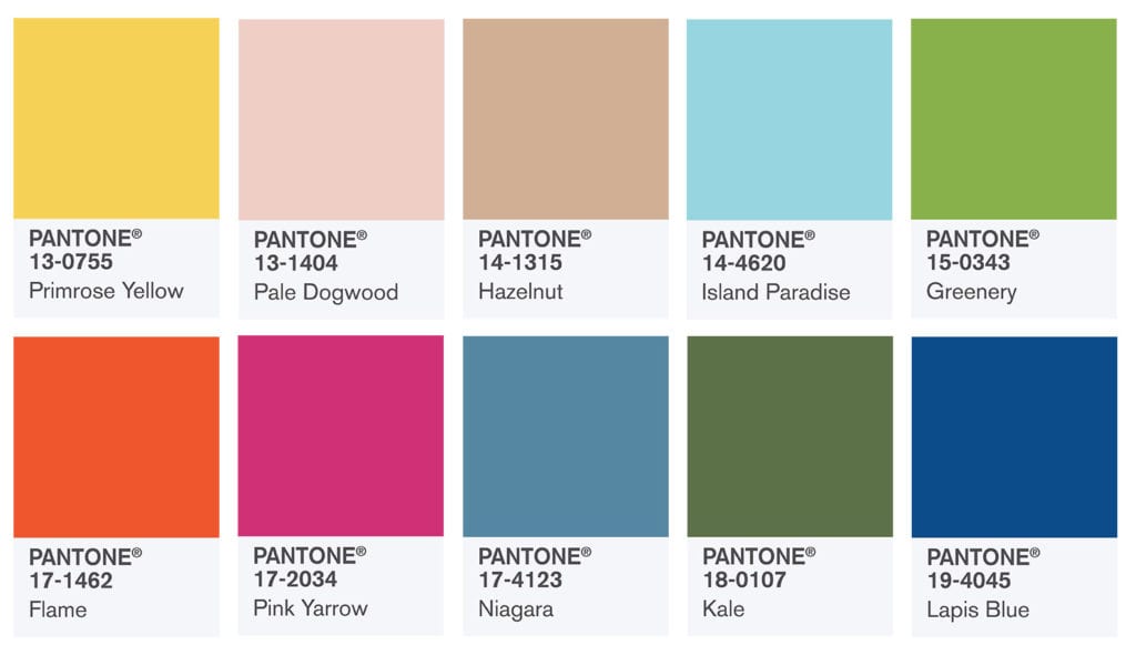
Living Coral was its annual hue for 2019. For 2018, “the global authority on color” selected Ultra Violet. It was Greenery for 2017, Rose Quartz and Serenity (2016), Marsala (2015), Radiant Orchid (2014), Emerald (2013), Tangerine Tango (2012), Honeysuckle (2011), Turquoise (2010), Mimosa (2009), Blue Iris (2008), Chili Pepper (2007), Sand Dollar (2006), Blue Turquoise (2005), Tigerlily (2004), Aqua Sky (2003), True Red (2002), Fuchsia Rose (2001), and Cerulean (2000).
The yearly reveal and the big marketing push that surrounds it helps Pantone to continually put its name on the map, and attract new clients “in every industry where color matters,” it says.
But far from offering just one new color on an annual basis, Pantone releases a larger selection of hues every one to two years. For instance, in March 2016, Pantone announced that it was “proudly introducing 112 new colors” to its existing system “to give designers a greater range of expression and freedom.” Before that, in 2014 and 2015, it added 84 colors to the mix, and between 2012 and 2013, Pantone incorporated a whopping 336 new hues. The company supplements its offering with seasonal color projections, and additional collections dedicated to its expanding arsenal of hues.
Such colors are compiled into an array of Pantone products – from its $805 “Color Specifier & Guide Set” to its $995 “Planner” for interior design – which are marketed to no small number of consumer-facing brands, whether it be high fashion brands or carpet-making companies, as “having the right colors to choose from is essential when making design decisions,” according to Pantone.
Much like privately-held Pantone’s stance on financial reporting (it does not disclose earnings, although its parent company, environmental & applied solutions, life sciences and diagnostics conglomerate Danaher Corp., generated $19.89 billion in revenue in 2018), the practice of selecting the “Color of the Year” is a closely guarded one, largely shrouded in mystery. What Pantone will say about the process is that it is far from a formulaic operation; the annual color-selection endeavor is a “highly subjective” one, says Pantone.
As Mental Floss noted recently in an effort to decode the process, “Twice a year, Pantone representatives sit down with a core group of between eight and 12 trend forecasters from all over the design world, an anonymous group of international color experts who work in product design or fashion, teach color theory at universities, or are associated with institutions like the British Fashion Council. They gather in a central location (often London) to talk about the colors that seem poised to take off in popularity, a relatively esoteric process that [Pantone VP Laurie] Pressman is hesitant to describe in concrete detail.”
While the shadowy meetings are held behind closed doors, Tom Vanderbilt, writing for Slate, was granted entrance, “on the condition that [he] not reveal the colorists’ identities.” Vanderbilt was also “asked not to reveal [his] own identity as a journalist [during the color selection committee meeting],” which he described as “a high-concept show-and-tell fused with a cultural anthropology seminar.” Instead, Vanderbilt says, “I [was] vaguely portrayed as a functionary of X-Rite,” the former corporate parent of Pantone before X-Rite and Pantone were scooped up by Danaher Corp. in 2012 for $625 million.
The meetings go down a little something like this: “One of the [committee member] forecasters, who is chosen on a rotating basis, picks an abstract theme before each meeting to get the brainstorming started. For the planning session for Autumn/Winter 2018-2019 trends, the theme is ‘time.’“ Mental Floss states that “everyone draws up their own color forecasts inspired by this theme and brings four or five pages of images – kind of like a mood board – with relevant color combinations and palettes. Then they gather in a room with good light, and each person presents their version of where the world of color is heading.”
The impact of annual selection stands to reach from the colors of the garments and accessories that appear on runways in New York, London, Milan, Paris, and beyond during any given season to the hues that florists bank on for arrangements. More than that, it proves an oft-seized opportunity for other brands to sell their own products. After all, “Pantone’s color prediction is, in part, a self-fulfilling prophecy,” Quartz’s Anne Quito writes. “Months before the [annual] unveiling each December, [Pantone] enters into licensing agreements with various companies – from nail polish-makers to hotel chains – in order to ensure that the exact hue materializes in various guises.” Suddenly, the “Color of the Year” is everywhere.
The New York Times’ fashion director Vanessa Friedman echoed this notion, writing on the heels of the “Color of the Year” reveal in 2017, which saw “Greenery” take the cake, “Pretty much just minutes after the announcement is made, my inbox is inundated with emails from brands and retailers promoting products available in the ‘Color of the Year.’” Such pitches, she noted, also come with side-by-side-by-side photos that coincide with articles detailing how the color has already been used on the runway in recent seasons, a nod to the fact that part of Pantone’s work is measuring the zeitgeist.
The idea that Pantone is doing less of trend forecasting than dictating is rarely divorced from the discussion around the company’s work. As Mikel Cirkus, who heads up the Conceptual Design Group at Firmenich, a Geneva-based flavor and fragrance company, told Slate in 2012, that the proliferation of garments and accessories bearing Pantone’s “it” color after its grand reveal “is not a coincidence. It’s not even forecasting in my mind, it’s a dictating thing.” In other words, brands are happy to follow the guidance provided to them by the various authorities in an attempt to calculate not only what hues will be most relevant for consumers in upcoming seasons, but also what fabrics, textures, textiles, prints, graphics, and other design elements are going to be of interest to the consuming public.
In the overly-corporatized landscape that is modern fashion, it makes sense that brands – especially those with shareholders to answer to – are increasingly risk averse and this sees them working to cater exactly to the whims of consumers. And the selection committee knows this.
One anonymous committee member told Vanderbilt, “We put seasons and dates on things. This color is for Summer 2013. People still need a direction … People always need confirmation. Even if you’re as strong as Zara, they need a start.”
*This article was initially published in December 2016 and has been updated.
Share