There is a series of visual trends currently playing out across the screens of many consumers’ smartphones. This series does not come in the form of app or UI design, but rather, it is a plethora of direct-to-consumer brands that are largely little-known. It feels as though every time you open Instagram, there they are, offering up a dizzyingly wide array of products – from trendy-looking cookware to strangely sleek-looking natural deodorant. These companies (and their offerings) are what I have come to think of as Instabrands.
For a while I found myself admiring their branding: a sweetly awkward chunky serif typeface here or a singular embrace of bold color there. Then I began to see the same set of elements playing out across a myriad of brands, and as this small collection of accepted visuals reverberated throughout the Instagram echo chamber, they began to lose meaning and precipitate a feeling of brand disorientation. Nonetheless, through their aesthetic choices, these Instabrands have cemented themselves into the current visual landscape. With art direction full of pink terrazzo counters and bright, succulent-filled living rooms, it can feel as if these brands act like Instagram users themselves, tirelessly trying to be on trend.
As Instabrands continue to proliferate, it is worth considering the implications of their branding. How did these Instabrands come to be? What are they and why do they feel so similar? And what – if anything – exists beyond their polished surfaces?
These companies got their roots roughly ten years ago when some of the early internet-born direct-to-consumers brands came onto the scene. Warby Parker, Harry’s, Glossier – brands that are now household names. Their products felt like that of trusted brands, but by cutting out middlemen, these retailers’ offerings were noticeably cheaper than those of their more established counterparts. Perhaps most importantly, these brands wowed customers with the novelty of experience. Think back a decade: buying eyeglasses online was a radical idea. And these brands made an impact in the marketplace: From 2013 to 2017, $17 billion in sales moved from big consumer brands to small brands.
More so than the early DTC brands, the Instabrands focus on aesthetics. This definitely is not a form of the larger “blanding” trend that has swept the fashion and luxury goods industries, among others, in recent years, as the Instabrands lean more toward the bold or carefully-curated than the bland. And this makes sense; there is now more choice in the market, which means that the model of DTC – and its largely uniform aesthetic – is no longer special.
While their early DTC predecessors focused heavily on acquiring customers via digital advertising, which included but was not limited to social media spend, Instabrands focus almost entirely on acquiring new customers through social media, and perhaps their branding is most focused around getting app-users to stop mid-scroll and take notice. By inhabiting a format designed for quick consumption, the Instabrands have not left themselves room to really say much of anything, let alone express their differences.
With so many of them acting alike as they vie for consumers attention, it seems like an apt time for them – and others – to disrupt the would-be disruptors.
Hard to see beyond the surface
Line 5 of the Base Design manifesto concludes with “we play with codes.” The idea is simple, but powerful. Certain categories have come to be associated with visual cues. Picture the branding for a chocolate maker: always brown and gold, right? Well, it does not have to be. Many of the Instabrands produce utilitarian products like mattresses, luggage, paint—think of the staid visuals associated with their brick-and-mortar counterparts. By comparison, the Instabrands have undeniably elevated branding in their categories and had some fun with the codes in the process.
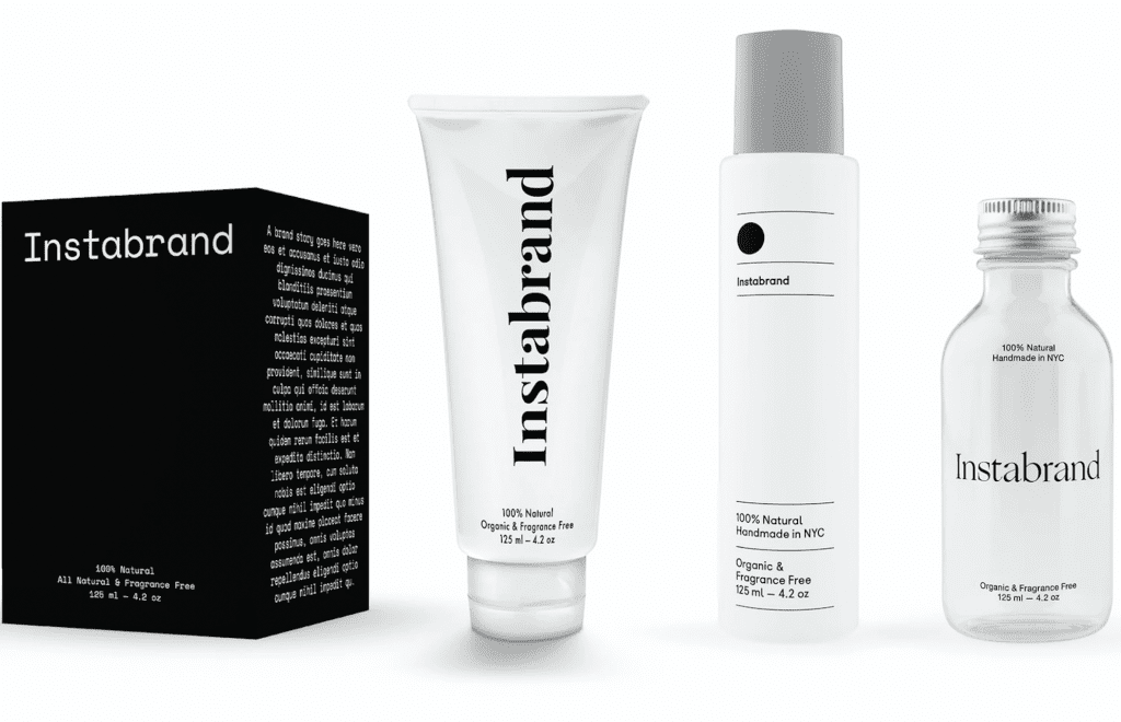
Beyond that, the Instabrands have successfully established that they are contemporary—not your parents’ boring brands (something that Tiffany & Co. explicitly advertised recently to a fair amount of pushback). The issue is that the Instabrands have drawn from a relatively small set of codes. Take that chunky awkward serif I liked so much, pair that with a pastel color palette, and voilà. You are a friendly brand. Or take a quiet sans serif, place it small in a large, mono-colored canvas, and you are sophisticated. Apply that chunky serif at a small scale with lots of white space and you are both friendly and sophisticated!
The Instabrands have now shown that their contemporary air can come in various flavors — warm, chic, or warm and chic. However, hinting at a few select personalities does not actually say much about these brands — their differences, promise, values, or missions.
A chance to differentiate
When brands wear the same clothing in order to simply look cool, it is hard to perceive much else about them. I will admit it: initially I thought the Instabrands were all surface and very little substance. However, there is more than meets the eye. As the Instabrands transition beyond being simply Instabrands, they can do more than just look good. They can actually begin to do good—as some already are.
Doing good can translate into good business. Communications consultancy Porter Novelli found in its 2021 Purpose Perception Study that 72 percent of Americans said they feel it is important that the companies they buy from reflect their values. Some of the Instabrands are already listening. Boie, for instance, is the first brand to make toothbrushes that are fully recyclable, which is a surprisingly tough feat. Allbirds engineered a box to ship its shoes in that is also the shoe box itself – no wasteful box-in-box. Due to their innate use of social media, the Instabrands have deep insights into their audience and can often react more quickly and more nimbly than traditional brands in order to match consumers desires.
Allowing consumers access to greener products, more sustainable shipping, or goods that better align with their values differentiates Instrabrands from established competitors, as well as themselves. It makes sense, as these are new brands for new types of customers. Still yet, many of the Instabrands have the platform to graduate into truly multi-dimensional brands. Evolving their already-crafted identities, ditching the overplayed tropes, and utilizing visuals and verbiage that is true to themselves will allow these individual brands to have a distinct voice. If not, they may simply fade into the memory of thousands of past internet fads.
Jeffrey Waldman is a graphic designer at Base Design in New York
Share