Over the past decade, countless brands traded character for clarity, swapping heritage for hyper-legibility in a rush to appear modern and “digital first.” In furtherance of a larger “blanding” trend, serif logos gave way to generic sans-serifs, and bold color palettes were largely wiped clean. In the tech space, in particular, distinct identities blurred into one another in a sea of lowercase word marks and minimalist design. The goal was accessibility, digital scalability, etc. – but the result was often visual uniformity.
Now, it seems the scales are tipping back. Companies that once stripped their branding of depth and heritage (as part of the larger wave of “blanding” efforts) are starting to reverse course, undoing their own subdued rebrands … or re-blands. They are rediscovering the power of specificity: layered typography, richer palettes, and design languages rooted in tradition and craft.
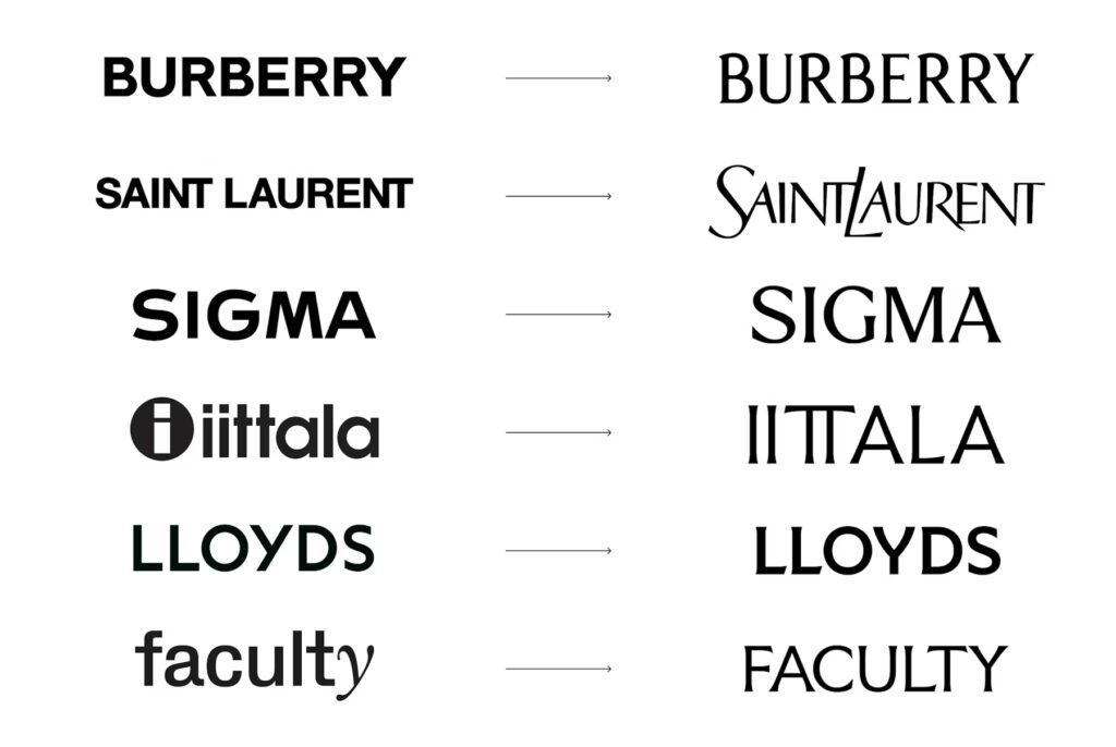
“Could formality – tradition, cultural specificity and maturity make a comeback in design?,” Mother Design’s design director Alec Mezzetti asked recently. “The early signs of this counter-revolution can be seen across the world of branding and advertising, where friendly colors, hyper-legible text and digital optimization are starting to make way for richer tones, serifs and a de-prioritization of digital scalability.”
It seems that brands across industries, including fashion/luxury, are waking up to the fact that abandoning their own established aesthetics in order to look like everyone else is no longer a competitive advantage (or better yet, maybe never was).
This is a short excerpt from a Snapshot that was published exclusively for TFL Pro+ subscribers. Inquire today about how to sign up for a Professional subscription and gain access to all of our exclusive content.
Share