In the late 1950s, a Cleveland Institute of Art graduate named James Modarelli was in the midst of his tenure at the laboratory that would become the National Aeronautics and Space Administration (“NASA”) Glenn Research Center just outside of Cleveland, Ohio. At the time, the then-43 year old National Advisory Committee for Aeronautics was being spun into a new agency, the one that we now know as NASA, and the restructuring called for a change in name and branding. So, the powers that be called on the space agency’s employees to submit designs for a new logo, and that is precisely what Modarelli did.
Inspired by a 1958 visit to the Ames Unitary Plan Wind Tunnel in Mountain View, California, where he was particularly impressed by a model of a radical supersonic airplane, the design of the plane, namely its “cambered, twisted arrow wing,” served as the inspiration behind the design of the official NASA branding, namely, a seal and a similar, but less formal, symbol that Modarelli submitted a year later.
Modarelli’s two designs were chosen and became the official symbols of NASA beginning in 1959. The latter design, “a bold, patriotic red chevron wing piercing a blue sphere, representing a planet, with white stars, and an orbiting spacecraft,” which has come to be known as the “meatball,” was the “everyday face” of the space agency and swiftly became “one of the most powerful symbols in the world,” while the seal was used as the more formal insignia for the agency’s operations.
For nearly two decades after Modarelli dreamt up the “meatball” design, it served as the most commonly-used symbol of and branding for the budding new NASA, but as the now-63-year old Washington, D.C.-headquartered space agency reflected recent April 2020, “with 1970’s technology, [the meatball] was a difficult icon to reproduce, and print.” More than that, “Many people considered it a complicated metaphor in what was considered, then, a modern aerospace era.”
Against that background and seemingly not immune to the desire to rebrand that is routinely experienced by its countless consumer-facing companies – from Apple and Mastercard to Mattel and all of the high fashion brands that recently opted into the “blanding” trend, NASA went back to the drawing board in the mid-1970s in search of a more “modern” branding. Again, it sent out a call for design proposals, and this time, the winning pitch would not come from someone within its own ranks, but instead, from Richard Danne and Bruce Blackburn. The two thirty-something founders of a New York design studio called Danne & Blackburn proposed “a futuristic wordmark that came to be known as ‘the worm,’” a reference to its zigzag-looking appearance, Wired wrote back in 2015.
The 1970s NASA branding was part of a larger domestic effort. In furtherance of then-president Richard Nixon’s “urgent desire that the growing partnership between government and the arts continue to be developed to the benefit of both, and more particularly to the benefit of the people of America,” the government launched the Federal Graphics Improvement Program in 1972. As a result of the launch of the program, which was active from 1972 to 1981, the National Park Service, the Environmental Protection Agency, the U.S. Postal Service, the Department of Transportation, and NASA, among others, all got gleaming, new visual identities.
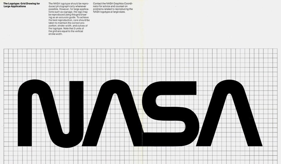
Up until that point, branding and “design was an afterthought for the government, if it was a thought at all,” according to Wired’s Liz Stinson. “The logos of the day, often a circle with the name of the agency around a gaudy illustration, were more like crests.” Danne and Blackburn wanted to change this for NASA.
At first, their proposed logo, with its “thick [red] lettering and crossbar-less A’s reminiscent of rocket nosecones,” was “a hard sell to an organization full of engineers who couldn’t care less about kerning and color swatches.” Reviewing the “worm” proposal shortly after it was first submitted, NASA’s then-administrator James Fletcher was not a fan. “I’m simply not comfortable with those letters, something is missing,” he stated, particularly “bothered” by the missing cross stroke of the “A’s.”
Ultimately, though, the simple-yet-innovative “worm” – and a 90-page Danne & Blackburn-created manual called the “NASA Graphics Standards Manual” that came with it – would prevail and come to adorn everything from NASA aircrafts and buildings to the agency’s official letterhead and its astronauts high-tech gear.
The “worm” stayed in place during the tenure of Fletcher’s successor, the George H. W. Bush-appointed Richard Truly, but things changed in the spring of 1992 when Dan Goldin, Bill Clinton’s pick for the job of Administrator of NASA. When he arrived at Langley Research Center, the NASA field center located about 3 hours outside of D.C. in the Chesapeake Bay-lined town of Hampton, Virginia, in May 1992, he “noticed that the meatball logo was still on the hangar.”
NASA “was in a slump at the time,” per Wired, “and Goldin saw an opportunity to boost morale.” He did so by canning the “worm” – or “retiring” it, in NASA-speak, with exception of “clothing and other souvenir items” – and reintroducing the “meatball” logo as its trademark of choice. As it turns out while the worm logo looked cool and was “considered a victory for graphic design, many of NASA’s employees hated it,” making the return of the “original late 1950s” meatball graphic a welcome one.
Fast forward 28 years from Goldin’s 1992 logo switch-aroo, and on April 2, 2020, NASA made a declaration on its website: “The worm is back!”
“In 1992,” NASA stated, “the 1970s [worm] brand was retired in favor of the original late 1950s [meatball] graphic … Until today,” that is. “The worm is back” … again, and it is “just in time to mark the return of human spaceflight on American rockets from American soil.”
According to NASA’s April 2020 statement, which asserts that “the meatball will remain [its] primary symbol,” the reintroduction of “retro, modern design of the agency’s [worm] logo will help capture the excitement of a new, modern era of human spaceflight on the side of the Falcon 9 launch vehicle that will ferry astronauts to the International Space Station as part of the Demo-2 flight, now scheduled for mid- to late May.” Oh, and “there’s a good chance you will see the logo featured in other official ways on this mission and in the future,” it states, noting that it is “still assessing how and where it will be used, exactly.”
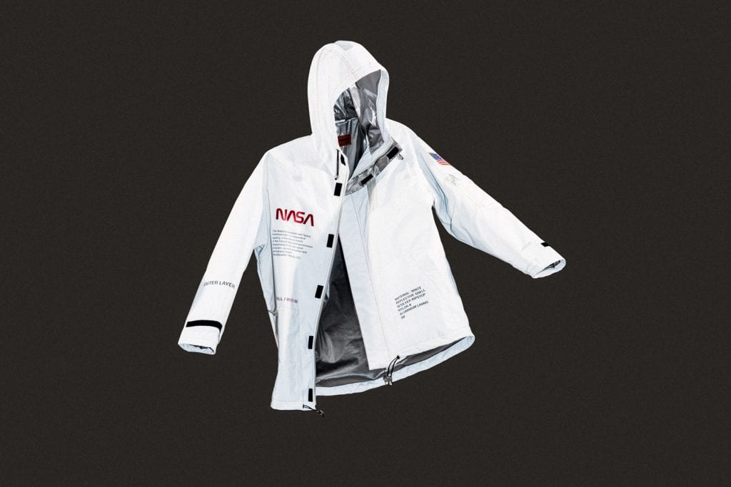
Until then, the worm, the meatball, and an array of other NASA iconography remains within the reach of virtually any company, given that NASA widely permits others to use – and monetize – its name and logos … free of charge as long as the designs are submitted to and approved by the Multimedia Division of NASA’s Office of Communications in Washington, D.C. (The agency will call foul, however, should brands seek to claim legal rights in the NASA name or related marks, as indicated by the proceedings it initiated in the late 1990s against London-based streetwear brand Nice and Safe Attitude).
That is why the worm does not only adorned the SpaceX Falcon 9 rocket that launched the Crew Dragon spacecraft in May 2020, but also appears on everything from highly-coveted Tom Sachs painted Kelly bags to Heron Preston-designed streetwear. Turns out, the worm was never actually retired after all.
*This article was initially published on April 3, 2020.
Share