Ask (almost) any company owner how difficult it is to create a brand that resonates with consumers, one that becomes synonymous with its products/services, its ethos, and its overarching operations, and they will likely tell you that it is hardly an easy feat. In fashion/luxury, some of the biggest-name companies have spent decades or even centuries in a handful of cases and billions of dollars building themselves into luxury brands – or better yet, “houses” in their lingo – that can demand thousands of dollars for apparel and leather goods, and not have consumers blink an eye because these brands (and thus, their offerings by extension) are so intrinsically synonymous with high fashion and/or luxury, exclusivity, craftsmanship, and the other virtues that these brands teams have worked so hard to embed into their DNA.
Regardless of whether a company is a luxury fashion house, an automaker, or a mass-market consumer goods chain, it takes time and no shortage of resources – financial and human – to build a brand that consumers recognize and one with which they associate goodwill – two different sides of the same coin. In other words, branding is far more than a word mark, logo, font, and/or a proprietary color; for the consumer, a brand is oftentimes defined by what it does/offers and not solely by its aesthetic. Nonetheless, the different ways a company projects itself to consumers is important, particularly with the ever-decreasing attention spans of consumers in mind and the increasingly crowded global market of competing brands with competing goods/services.
Enter: The logo, a brand’s most immediate representation of itself to consumers. If designed and marketed effectively, a logo and/or a stylized word mark acts as an indicator of source of goods/services. It enables allows consumers to instantly identify the maker of a product, and beyond that, it can enable them to make judgments as to the inherent quality that they can expect from that brand’s goods and services (thanks to the goodwill that such a brand has built up as a result of operating, marketing, etc.). Consider Louis Vuitton’s signature “LV” logo. Not only does it practically indicate that an authentic bag is from Louis Vuitton, it suggests that the bag is of a certain quality that one can expect from the French fashion luxury brand.
Elsewhere in the market, Nike’s Swoosh logo comes to mind, seeing that symbol alerts consumers of the source of a pair of sneakers, as well as certain other intangible qualities, such as innovation-driven, high quality, high-performance, etc. Such goodwill has been driven my decades of Nike products but also decades of marketing, including Nike’s alignment of itself with world class athletes, cutting-edge designers, and so on.
These examples (and others) demonstrate that familiarity with a company vis-a-vis its name and/or logo enables consumers to make instinctive decisions about a company and its products that might otherwise require research Moreover, without such branding, it would more difficult for customers to differentiate between various competitors, even in an e-commerce world.
Against that background and considering that building a strong and identifiable brand is one of a company’s biggest investments in the first place, moves by well-known companies to change their branding – whether that be their logos, packaging, or other aspects that make up a brand – come with risks. So, why do brands revamp?
A few key factors come to mind. For one thing, many companies opt to rebrand to evolve with the market and stay relevant; this includes but is certainly not limited to practical concerns, such as the need for a logo to register well on any browsing device, particularly given the vast shift to mobile. At the same time, branding is often tweaked or changed to reflect an expansion in product or service categories, to limit negative associations with prior logos, and to reflect a merging of companies.
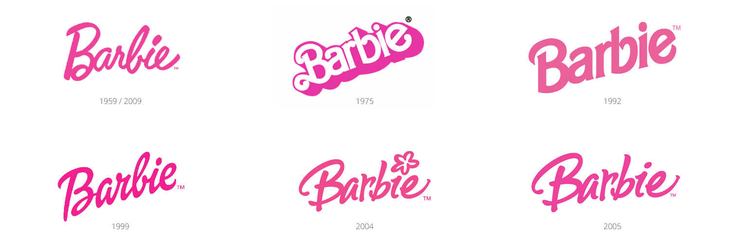
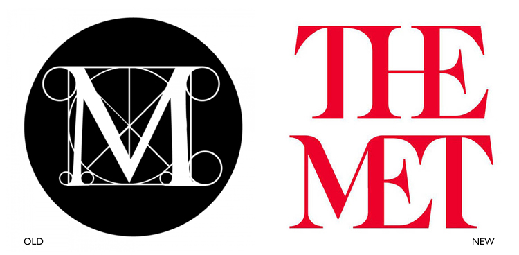
Such changes are certainly not unheard of. Consider a few examples: Pepsi has undergone changes 10 times since 1898. Six changes have come from Barbie since it launched its original logo in 1959. Five changes for Apple since 1976 – including a recent reversion to an older logo. Four changes for Microsoft since 1975. And in the past year or so, alone, we’ve seen a number of extremely well known brands re-brand. Instagram introduced a new logo (along with a new algorithmic timeline), the Metropolitan Museum of Art, MasterCard, Uber, and Netflix did, too. Since 1997, Google has updated its logo six times.
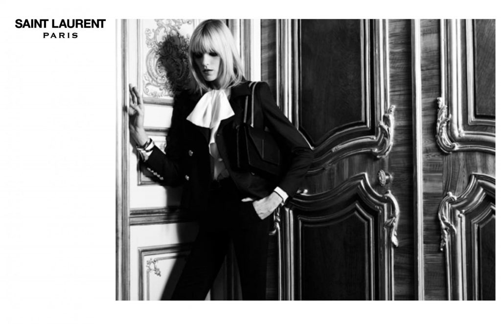
The television channel formerly known as ABC Family revamped to FreeForm, and on the fashion front, a few years ago, Yves Saint Laurent, under the creative direction of Hedi Slimane, renamed its ready-to-wear line simply, Saint Laurent.
Netflix dropped a new logo, dropping the “etflix” in favor of a simple red “N.” Before this update, Netflix had been forced to cram all seven letters of its name onto social networks and the tiny icon of its iOS app. Uber debuted its new look alongside the latest Uber app update, version 2.118.8. A complete departure from its original icon featuring a stylized “U,” the new Uber icon is a non-distinct image of a square embedded in a circle. As for MasterCard, the fifty-year old company’s new simplified mark features retains the brand’s distinctive red and yellow circles, but gone are the teeth, the capital C and a “dated” italic font.
And don’t forget the Met’s new logo, of which famed graphic designer Michael Bierut, of Pentagram, says: “It reduces the name to two red three-letter words—THE MET—and composes those six letters in a complex arrangement, connecting each to the next, merging the verticals in the HE and ME pairs, all in a font with exaggerated serifs that border on flamboyant. It is a nervy, bold design that begs for a strong reaction, and that’s what it got.”
As for why some of the aforementioned companies rebranded, here’s what their execs had to say:
Tom Ascheim, President of FreeForm: The real reason to change the name is to try to grow. There was a perception gap between the people who love us and the people who don’t know us. When I talked to fans they’d say, ‘We like you, but we don’t want to tell anybody.’ They ignored our name and brand and loved our shows. It was an interesting contradiction.
Travis Kalanick, CEO of Uber: One of the big changes over the years is that Uber no longer moves just people; we’re now moving food, goods, and soon maybe much more. With the potential for many apps with many app icons, we needed one approach that connected them all. So we came back to our story of bits and atoms. You’ll see that both rider and driver icons have the bit at the center, and then the local colors and patterns in the background. This is a framework that will also make it easy to develop different icons for new products over time.
Chuck Breuel, VP Brand Marketing for MasterCard: We haven’t touched our brand mark for about 20 years now and the company has changed really dramatically in that time. We’ve expanded all of our products and services and that’s really accelerated over the past few years, so we took a look at the logo and said, ‘I think we can do some things to have it more closely reflect where the company is’. To make it simpler, more impactful in a way, but still instantly recognizable.
Raja Rajamannar, Chief Marketing and Communications Officer for MasterCard: We wanted to emphasize the fact that MasterCard is no longer just a card product — the future will be predominantly digital.
According to a statement from Instagram: The simpler design puts more focus on your photos and videos without changing how you navigate the app … The Instagram community has evolved over the past five years from a place to share filtered photos to so much more — a global community of interests sharing more than 80 million photos and videos every day. Our updated look reflects how vibrant and diverse your storytelling has become.
Jonathan Lee, a Google creative director: With the latest change, we wanted to future-proof the brand. There are things we know are coming: We’re designing for wearables, to have our brand work on a watch face or in Android Auto in cars. That was the core momentum builder.
Hedi Slimane, former creative director of Saint Laurent: Historically, Yves decided with Pierre in 1966 to name his revolutionary ready-to-wear ‘Saint Laurent Rive Gauche.’ Yves wanted a clear dichotomy with his couture. It was for him a distinctive sign of modernity, and a drastic change from the Couture label … The return to the original name would help me to recreate a legitimate and lost balance.
In short: it seems most of the recent changes are being born from the larger need to reach more consumers and adapt to modern day life. Dan Clarke, Design Director of JP74, a UK-based web development company, echoes this notion, saying: “I think that a rebrand is an opportunity for companies to realign themselves in terms of how they’re perceived or how they’ve changed over time. Today we’re exposed to brands more than ever, and I think people in general are more savvy/sensitive to the messaging a brand can convey.” In terms of practical application, Clarke sees a large scale “shift towards more simple, streamlined logos and logotypes – Less fuss and more clarity.”
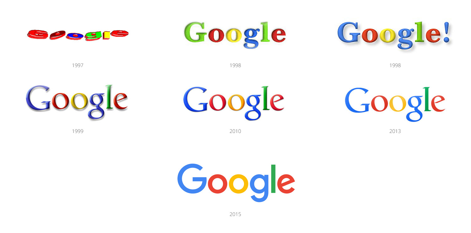
As indicated above, this is almost certainly the result of significant practical concerns, which is why flat designs – as opposed to bold, 3-D logos – continue to dominate. It is not just because they look clean and forthright, but because they register well in any browsing platform or device. In the past, logos only had to look good in print. Today, brands exist on dozens of platforms, many of which are very small, like smartphones. This logistical challenge has limited what designers can do and has led to a rise in minimalist-type designs. This was largely the rationale behind Google’s September 2015 font change. The company had been using a serif font since 1999 but switched to a sans-serif font designed by its own internal team to allow it to be easily scalable at any size.
Regardless of the reasons for such changes, the relative infrequency of changes to any given brand’s logo and the large amounts of time in between major re-designs make one thing very clear: While it is, in fact, important to keep up with modern trends, it also important to ensure that branding remains consistent. As famed graphic designer and art director Paul Rand, who was responsible for corporate logos that included ones for IBM, UPS, ABC, and Enron, said, a good logo provides the “pleasure of recognition and the promise of meaning.” Too much change will rob a brand of its meaning and the years of building a cohesive, recognizable brand will be lost.
With this in mind, brands must be cognizant of the balance between relevance and brand identity, the latter of which is what companies spend so much time developing in the minds of consumers. The balance here is crucial, as relevance at the expense of brand identity is seemingly pointless. And the same can be said for a reversal scenario. Redesigning a familiar logo is risky business, after all. Just ask the Gap.
Share