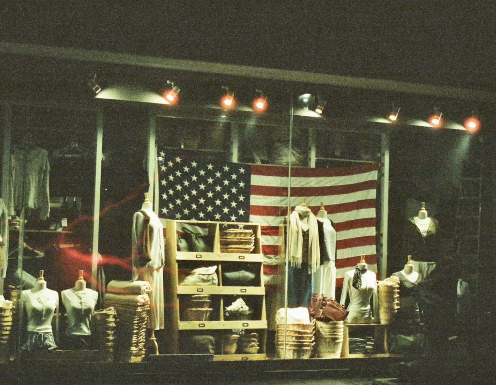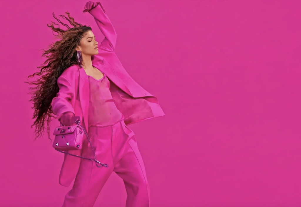
PART I – In March 2022, Valentino showed a collection that consisted of almost 50 looks – from “tiny bubble dresses to sweeping opera coats to tailored suits and overcoats,” Vogue’s Sarah Mower wrote at the time – all in a hue that the Italian fashion brand is calling “Pink PP.” Creative director Pierpaolo Piccioli said that he opted for the vivid fuchsia-like shade for Fall/Winter 2022 in order to “remove distractions and concentrate the viewers’ eyes on distinguishing the differences between silhouette and detail.” Pink PP-hued garments have since found their way onto red carpets and into social media discourse – with consumers routinely commenting on the influx of “Valentino Pink” looks.
There certainly may be design-centric reasons for the selection of a single color and the creation of a collection almost entirely in that single hue, as Piccioli says. But there is likely more to it than that. It is difficult not to see the branding angle at play for Valentino, which has since put the specific hot pink color that it crafted with the help of color-creating-powerhouse Pantone at the center of product packaging, ad campaigns, and “guerrilla projects to be executed globally.” Valentino has also taken to offering up hot-selling accessories in the new hue (and styling them on big-name celebrities) – from its $1,500 Vani Tan-Go Platform Pumps in pink, which have found their way onto the likes of Anne Hathaway, Gigi Hadid, Dua Lipa, and Florence Pugh, among others, to a specific Pink PP version of its One Stud shoulder bag.
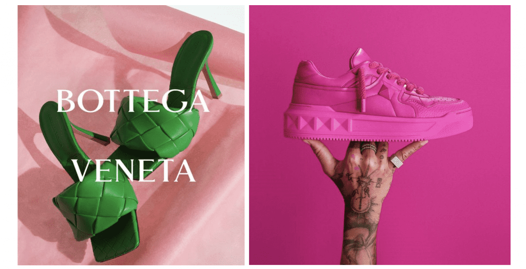
The element of branding is worthy of attention here, as colors are valuable assets for brands. One need not look further than Bottega Veneta, whose shade of “Bottega green” has dominated the fashion market over the past several years, being deemed the “color of the year” for 2021 by no shortage of media outlets. Thanks to a steady stream of “it” accessories and broader branding efforts by Bottega Veneta to incorporate the color into its ad campaigns, large-scale installations (including a takeover of the Great Wall of China), stores, and branding for its “Bottega Radio” venture, a connection between the hue and the Kering-owned brand was formed in the minds of consumers across the globe.
Taken together, “Bottega Green” has come to serve as a designation for the fashion and leather goods company in largely same way as its name and signature intrecciato weave design have for decades.
Color as a Calling Card
The notion that colors can act as indicators of source is, of course, not a novel one. The ability of companies to rely on trademark law – a form of intellectual property protection that applies to “any word, name, symbol, or device, or any combination thereof” that is used to “identify and distinguish” one’s goods or services from those of others – was confirmed by U.S. Supreme Court back in 1995. In deciding Qualitex Co. v. Jacobson Products Co., a landmark case that centered on the protectability of the green-gold shade of Qualitex’s dry cleaning press pads, the Supreme Court explicitly stated that a color can be registered as a trademark as long as it identifies a single source for the products/services at issue.
Writing for a unanimous court, Justice Stephen Breyer asserted at the time that while “color [sometimes] plays an important role (unrelated to source identification) in making a product more desirable, sometimes it does not.” According to the court, the latter instance (i.e., when a color is “not essential to a product’s use or purpose and does not affect cost or quality”) demonstrates that there is not an absolute bar to the function and protectability of color as a trademark.
A decade earlier, in 1985, a panel of judges for the U.S. Court of Appeals for the Federal Circuit held that the color of insulation-maker Owens Corning’s pink fiberglass materials (Pantone 210) was entitled to federal registration by the U.S. Patent and Trademark Office (“USPTO”). The court was swayed by the substantial evidence of acquired distinctiveness provided by Owens Corning, including advertising expenditures exceeding $42 million and a survey data showing that 50 percent of respondents named Owens Corning as the only manufacturer to offer up pink insulation.
Qualitex and Owens Corning are not the only examples of companies that have built their businesses on – and looked to register – color trademarks. In addition to enjoying longstanding common law rights as a result of its consistent use of a specific color for the purpose of source identification, Tiffany & Co. has maintained federal registrations with the USPTO and other trademark offices for its robin’s egg blue color (Pantone 1837) for use on an array of goods and services – ranging from fragrance products, tableware, and leather goods to product packaging and retail services … and of course, jewelry since at least the 1990s. (Tiffany’s use of its signature blue dates back to at least 1889 and the World’s Fair in Paris.)
Christian Louboutin also famously maintains trademark rights in the “Chinese red” (Pantone 18-1663) hue for use on the soles of contrasting-color shoes. (In its September 2012 opinion in the Louboutin v. Yves Saint Laurent case, in which it held that a single color can be registered as a trademark upon a showing of secondary meaning, the U.S. Court of Appeals for the Second Circuit determined that Louboutin’s famous red sole trademark for footwear is valid – albeit only when the red sole mark contrasts with the color of the rest of the shoe. At the same time, the Second Circuit affirmed the lower court’s refusal to levy a preliminary injunction against YSL in connection with its sale of monochromatic red shoes on the basis that the all-over red shoes fall outside the scope of Louboutin’s trademark rights.)
Beyond that, Hermès has built up rights in (and has registrations for) a shade of orange as applied to “the exterior of merchandise boxes for goods” ranging from handbags and clothing to jewelry and fragrances, as well as for retail store services; and millennial beauty brand Glossier has rights in specific uses of its millennial pink (Pantone 705 C), namely, on cosmetics-related product packaging.
Outside of the fashion world, UPS has trademark registrations dating back to 1998 for its “Pullman” brown color “applied to the vehicles … [for] motor vehicle transportation and delivery of personal property,” and “applied to the clothing,” in connection with the “delivery of personal property by air, rail, boat and motor vehicle.” The shipping/receiving and supply chain management company also boasts registrations for the word “Brown” for use on “headgear, namely, baseball hats and caps, and visors; shirts; all used in connection with promoting or providing transportation and delivery services.”
Still yet, T-Mobile has registrations for the shade of magenta that appears across its brand – for use on “telecommunications and information technology services,” among other things. Coca-Cola consistently uses its red hue in furtherance of its sale of soda, with James Sommerville, Cola-Cola’s former VP of global design, saying that the company’s use of its color red across the Coca-Cola ecosystem “reminds consumers that regardless of the beverage they purchase, they’re buying into Coca-Cola as a simple idea.” And the list of companies that use color as their calling card goes on.
Color Trademarks in a Crowded Market
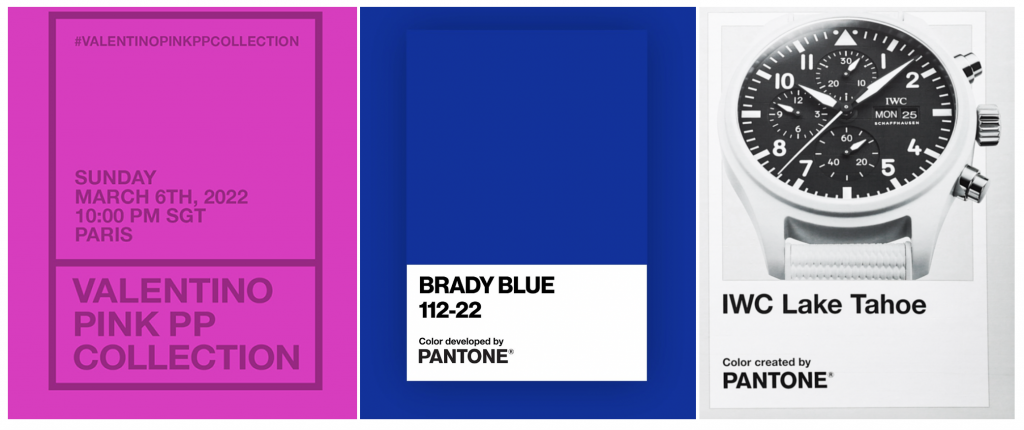
With Bottega Veneta, Valentino, Tom Brady’s brand (which debuted a Pantone-created “Brady Blue” (Pantone 112-22) last year), and watchmaker IWC, among others, currently pushing relatively new color trademarks, the adoption of color-centric branding appears to be finding favor among a growing number of companies at the moment. This makes sense, as against the background of a crowded market, in which consumers are inundated with branding, rebranding, co-branding, etc., the onus is on companies to not only stand out but to engage consumers, who will (at least in theory) help them to advertise their company and its products/services even further. As such, these recent embraces of color as an indicator of source by fashion industry/luxury players come as part of a bigger push by companies to go beyond – or better yet, to complement – their most obvious trademarks (namely, word marks and logos) with additional branding in order to denote the source of their goods/services in buzzy ways.
In this vein, color marks are also surely a strategy for coping with the state of the fashion/luxury goods market, which is thoroughly saturated with an abundance of trademarks – even ones that go so far as to mash two companies’ existing branding together; Fendace comes to mind here. (The sheer scope of trademarks that are currently in use by consumer goods/services companies makes it difficult, as some academics have argued, for brands to adopt attractive new marks, potentially forcing them to branch out beyond things like word marks to better capture consumer attention.)
At the same time, as TFL has asserted in the past, companies’ exercises in less conventional (although, not entirely unconventional) branding are also a response to the overarchingly visual nature of the Instagram and TikTok-dominated market and the consumers that comprise it. The pool of fashion/luxury buyers has come to include demographics like millennials and Gen-Z; these are consumers that face an endless barrage of ads, that engage with brands far more than previous generations, and that expect/demand more from companies. This extends to branding – hence, the success of Off-White, which has successfully adorned its offering with novel takes on trademarks, such as quotation marks and zip ties, and Glossier with its easily-identifiable pink-bubble-wrap pouches.
Ultimately, branding is no longer just a tool for companies to distinguish their goods/services from those of their competitors (although, that it the critical function of trademarks) and consumers now interact with companies and their branding in ways that go pure source-identification thanks to the rise of smart phones and other tech. As such, branding enables companies to connect with consumers in new, engaging, and ideally, viral ways. And companies – from Qualitex to Valentino – appear to see clear value in the adoption and consistent use of color (piggybacking on top of what they are already doing with their source-identifying word marks, logos, patterns, etc.) to distinguish themselves and their offerings from others – as well as to potentially cut through some of the noise in the process … ideally, by creating noise of their own.
This is Part I of a longer-running series on color trademarks that was initially published in September 2022. In Part II of this series, which is an Enterprise-exclusive publication, we examine the issues that companies face in claiming rights in color marks and relevant strategies for successfully doing so.
Sign up for an Enterprise subscription today to gain access to all of our content.
Share